Why More Indicators Don't Help (Indicator Overload)
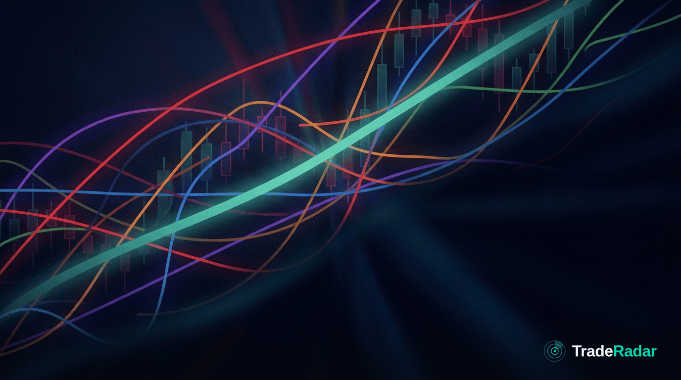
Adding a tenth indicator to your chart feels like adding a tenth opinion, but it usually isn't — most indicators are the same price data reshaped, so they agree by construction and lag together. The fix for a decision you can't make isn't another oscillator. It's understanding the force moving the market. Here's the case, laid out fairly.
What an indicator actually is
Every classic indicator is a transformation of price and volume you already have. A moving average smooths price. RSI rescales it. MACD subtracts one moving average from another. Bollinger Bands wrap it in a volatility envelope. None of them import new information — they re-express the same series in a different shape.
That matters because it explains why stacking them feels productive but rarely is. When five indicators built from the same closing prices all turn up at once, that isn't five independent confirmations. It's one input, echoed five times. The screen gets busier; your actual edge doesn't grow.
The overload problem
Indicator overload isn't just visual clutter, though the clutter is real. It's a set of structural traps:
- Redundancy dressed as confirmation. Momentum indicators mostly track momentum. Trend indicators mostly track trend. Loading three of each doesn't triangulate the truth — it double-counts the same signal and makes you feel more certain than the evidence warrants.
- Lag compounds. Almost every indicator is derived from past prices, so each adds a small delay. Wait for six of them to line up and you're acting on a description of what already happened, well after the move that caused it.
- Conflicting reads, no referee. Add enough tools and some will always disagree. With no framework to rank them, you end up picking whichever one confirms what you already wanted to do. That's not analysis — it's justification.
- Curve-fitting your own chart. The more inputs you tune, the easier it is to make the past look explainable and the harder it is to know if any of it will hold up next week.
Why "just find the right settings" doesn't solve it
The common response to overload is optimisation: tweak the periods, change the thresholds, find the combination that would have caught the last big move. The problem is that this tunes the tool to history, not to cause. You can always find settings that fit what already happened. What you can't do — with settings alone — is answer why the market moved, which is the only thing that tells you whether the next move rhymes with the last one.
An indicator can tell you price is stretched. It cannot tell you whether it's stretched because of a one-off flow that's about to reverse or a shift in the macro backdrop that's just getting started. Those two situations look identical on an oscillator and demand opposite trades.
What actually adds information: context
The way out of overload isn't a better indicator or fewer indicators — it's a different question. Instead of "what does the chart say," ask "what is moving this market, and is that reason still intact?"
- Start with the driver. Yields, the dollar, inventories, positioning, an earnings surprise — something is doing the pushing. Name it first, and the chart becomes confirmation rather than the whole case.
- Read across assets. The reason an equity index is moving often lives in the bond or currency market. No amount of indicators on the equity chart will show you a driver that lives on a different screen.
- Keep the chart quiet. A clean chart with one or two references and a clear thesis is easier to act on — and easier to review afterward — than a wall of overlapping lines.
- Define what breaks it. A view grounded in a driver comes with its own invalidation: if the reason for the move is gone, the trade is done, regardless of what the oscillators say.
Indicators describe. Context explains. You need the second one to decide.
The honest trade-off
Indicators aren't useless, and this isn't an argument for a blank chart. A moving average as a reference or a volatility band for sizing can genuinely help. The trap is treating quantity as quality — believing that more lines mean more insight. They don't. The discipline of asking "why is this moving" is harder than adding another overlay, and it won't give you the comforting feeling of a fully loaded screen. But it's the part that actually informs a decision.
This is the idea behind TradeRadar: the decision layer above charts, news and calendars — what's moving, why, where the edge is, and what would prove the thesis wrong. Not more indicators. Understanding.
TradeRadar is decision-support software, not investment advice. Trading involves risk, and no approach removes it.
Frequently asked
How many indicators should I use?
There's no magic number, but fewer is usually clearer. Because most indicators are built from the same price data, adding more tends to repeat information rather than add it. A couple of references plus a clear reason for the trade beats a crowded chart.
Why do my indicators contradict each other?
Because they measure different aspects of the same price series over different windows. Contradiction is normal and expected — which is exactly why you need a framework (the driver behind the move) to decide which read matters, rather than another indicator to break the tie.
Do trading indicators actually work?
They work as descriptions of past price and volatility, which can be useful for context and sizing. They don't work as explanations of why a market is moving, and they can't tell you whether the reason behind a move is still valid.
What should I focus on instead of more indicators?
Focus on the driver: what is actually moving the market, how it connects across related assets, and what would invalidate the thesis. Use a small number of indicators as support, not as the decision itself.
Related in The Bigger Picture

A Good Setup With No Reason Is a Gamble
A clean setup with no reason behind it is a gamble in disguise. Here's the difference between a trade setup and a thesis — and why the thesis is the edge.
Charts vs Context: What Price Alone Can't Tell You
Technical analysis shows what price did, not why. Here are the real limitations of charts alone — and the context that turns a pattern into a decision.

Confirmation vs Invalidation: Know What Breaks Your Trade
Confirmation feels good; invalidation keeps you solvent. Learn to define what would prove a trade wrong before you enter — and exit on evidence, not hope.